If you as a viewer are new to my work you may say, wow, this guy really loves mountains! The second comment may be, why the dots? Well, these comments or questions and others are often fielded to me or my gallerists by viewers.
1) What inspired your paintings, and what story are you trying to tell through it?
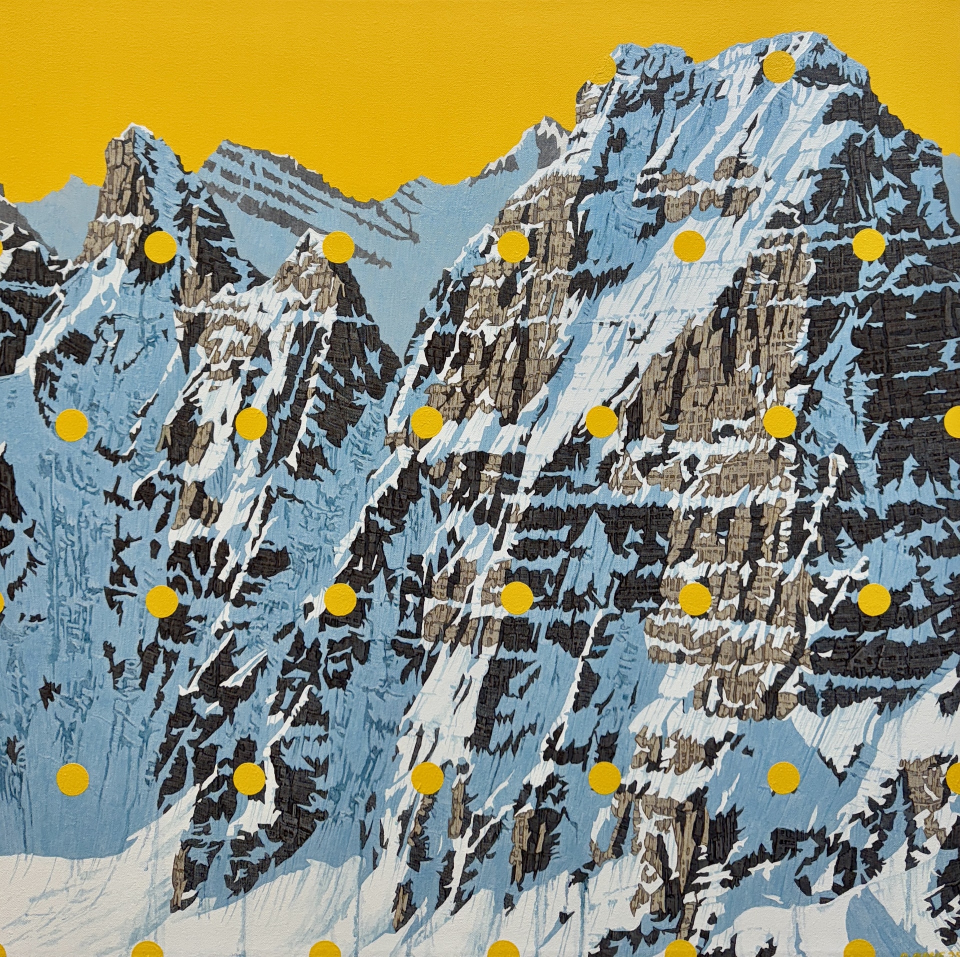
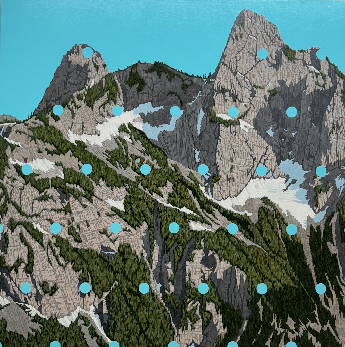
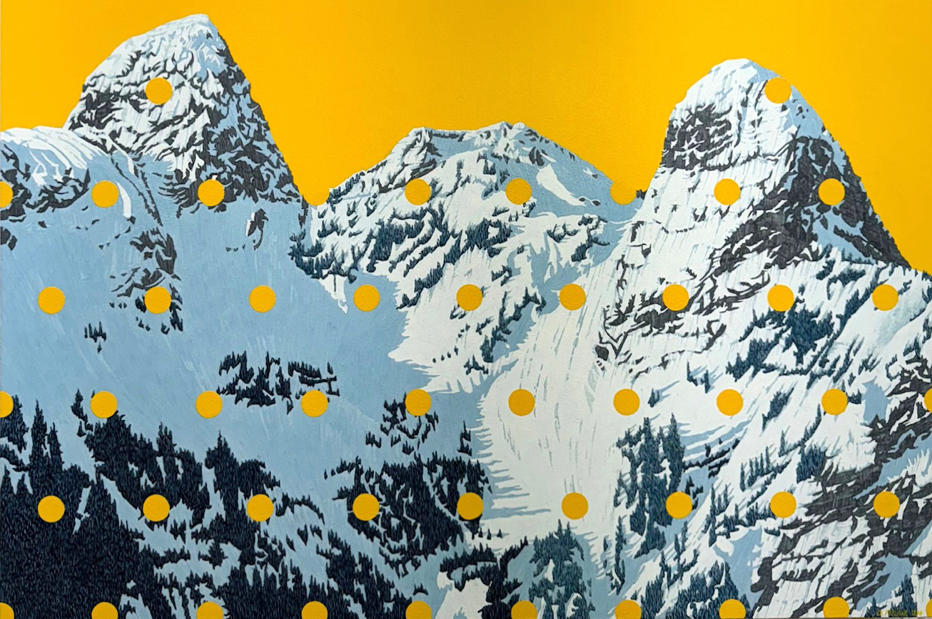
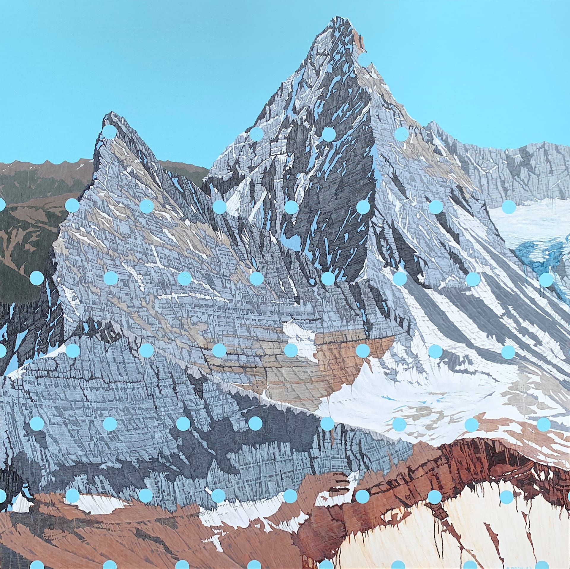
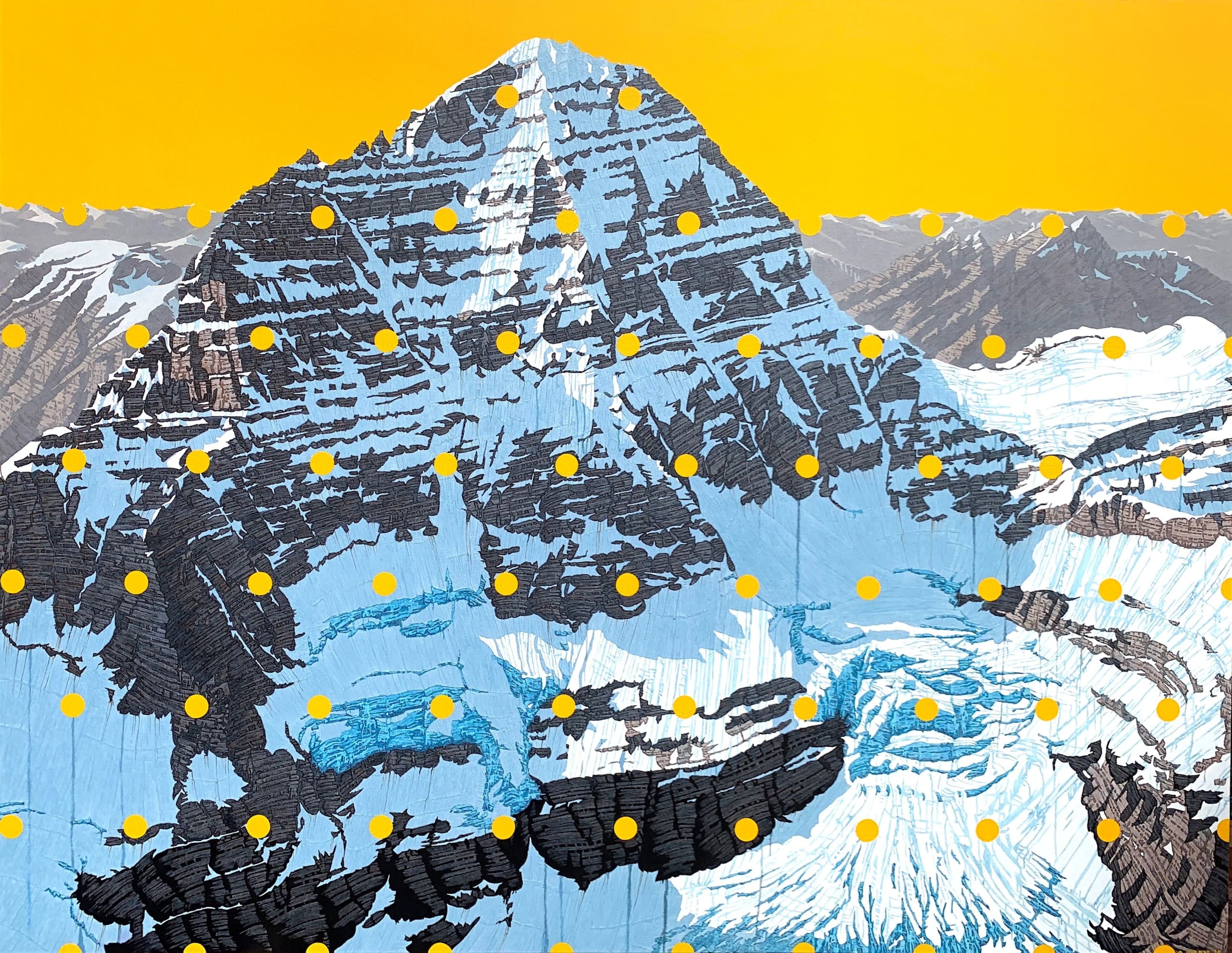
Firstly, yes I do love mountains! I often climb and ski them. I know them rather well in fact. All the mountains I portray are complex puzzles of route finding, hazards and discovery. Certain words or phrases often come up in the description of the mountain, the sublime, its ineffability, inaccessible, terrifying, heavenly. These are all great descriptors and I feel them all when in them and painting them. My story here is just that, as an interesting addition I add the fantastically bright vibrant colours of the background and dot overlay to convey the mountain as iconic, putting it in the great pop art lexicon. There is also a neat little metaphor for mapping and coordinates.
2) How do you decide on the colors and textures in your paintings?
This is kind of a two-part answer because there is the painting of the mountain, then the background and overlay. I have to admit I am a little fussy with detail, which is evident in both. Yes the mountain is painted in pretty exacting detail, but looking closely you can see evidence of running paint and drips, adding to a textural underlay I use to great benefit to convey erosion and fracturing glaciers for example. The colours of the mountain are in no way an exact replica but I have a feel for the rocks, snow and ice, light, dark. This comes with a lot of time spent in the mountains. As for the choice of the vibrant colour background and dot overlay, A, it looks really cool! B, it contemporizes the painting. It’s such a great contrast to the mountain and it typically gets chosen as an opposing hue to mess with your eyes, I’m not kidding!
3) Do you have a favorite piece, and why does it stand out to you?
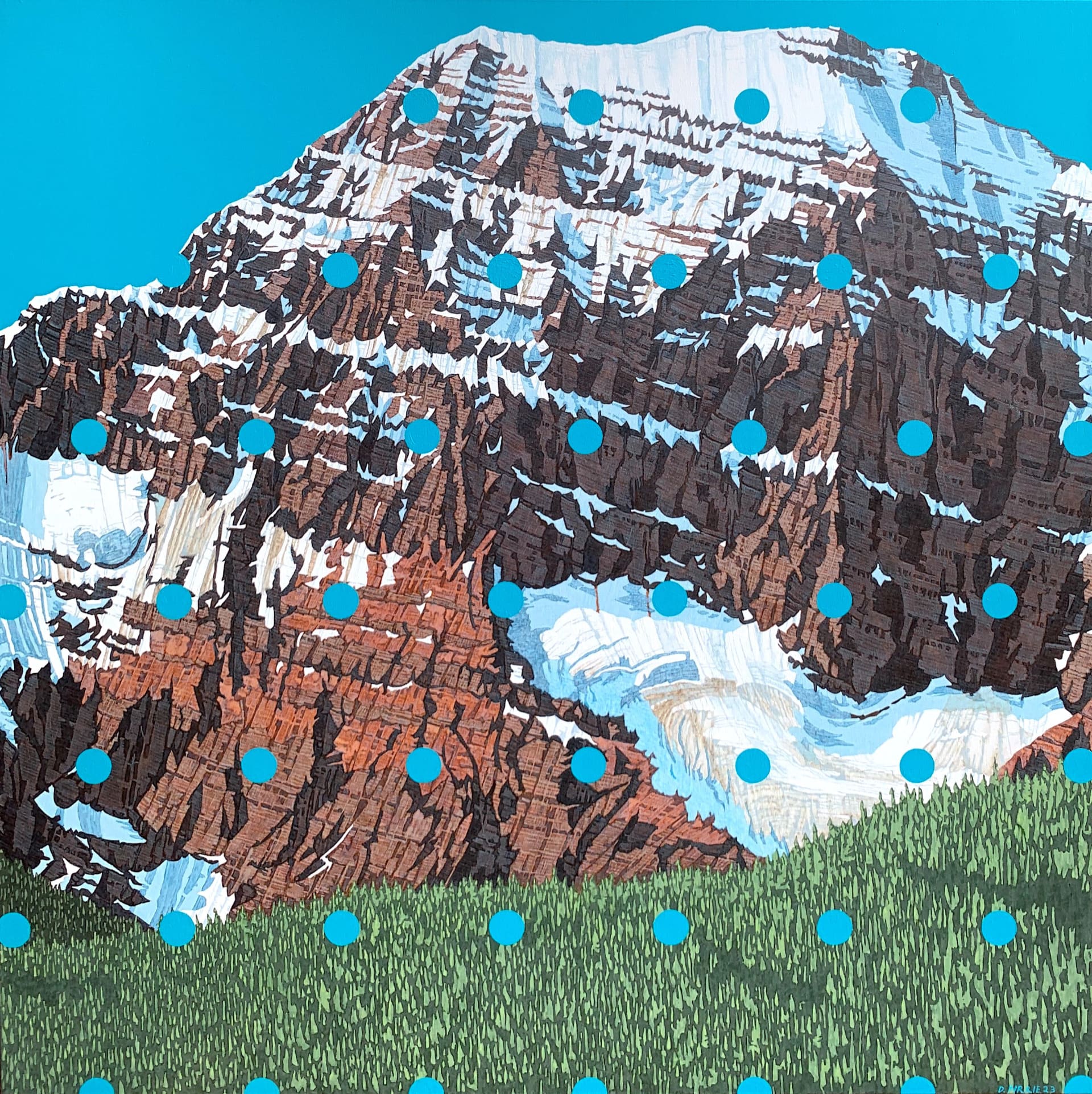
Mt Sir Donald, Rogers Pass BC, 2023. Look at those knife sharp ridges! It brings you in, up, back down, up again to a seemingly impossible looking peak and then down again off into a distant ridge. Of course many have climbed it, but not me. It scares me. This mountain looms over Rogers Pass as you drive east into it from Revelstoke BC, dominating the skyline. Sublime!
4) What’s your creative process like—do you plan every detail, or do things evolve as you paint?
My process is unapologetically pedestrian! Kind of kidding but not really. What I mean is it’s pretty straight forward and broken down into steps, some very long steps! I have a pretty strong idea from the get go of what I want the painting to be, in all its time consuming detail. I have no problem with getting at it so to say. The need and inspiration is always there, and I really thrive on the exactness of the breakdown of the steps and blocking in the many layers of the painting. I do though in fact leave room for wayward thoughts and mistakes, I really have no interest in hiding the fact it is a painting.
5) If someone is new to your work, what’s one thing you’d like them to know or feel when they see your art?
Awesomeness!